Digital Single Series & Brand Identity Study
The Challenge:
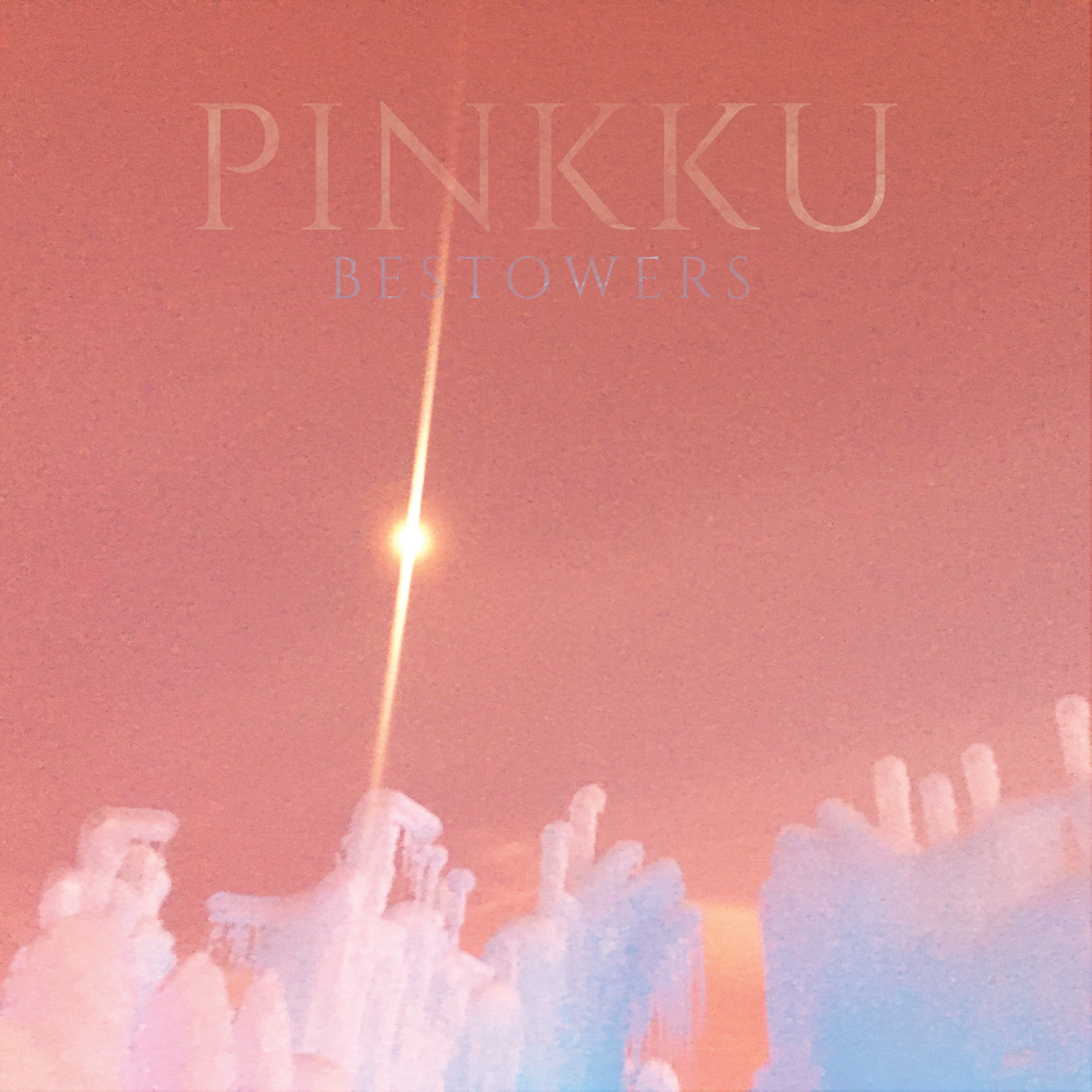
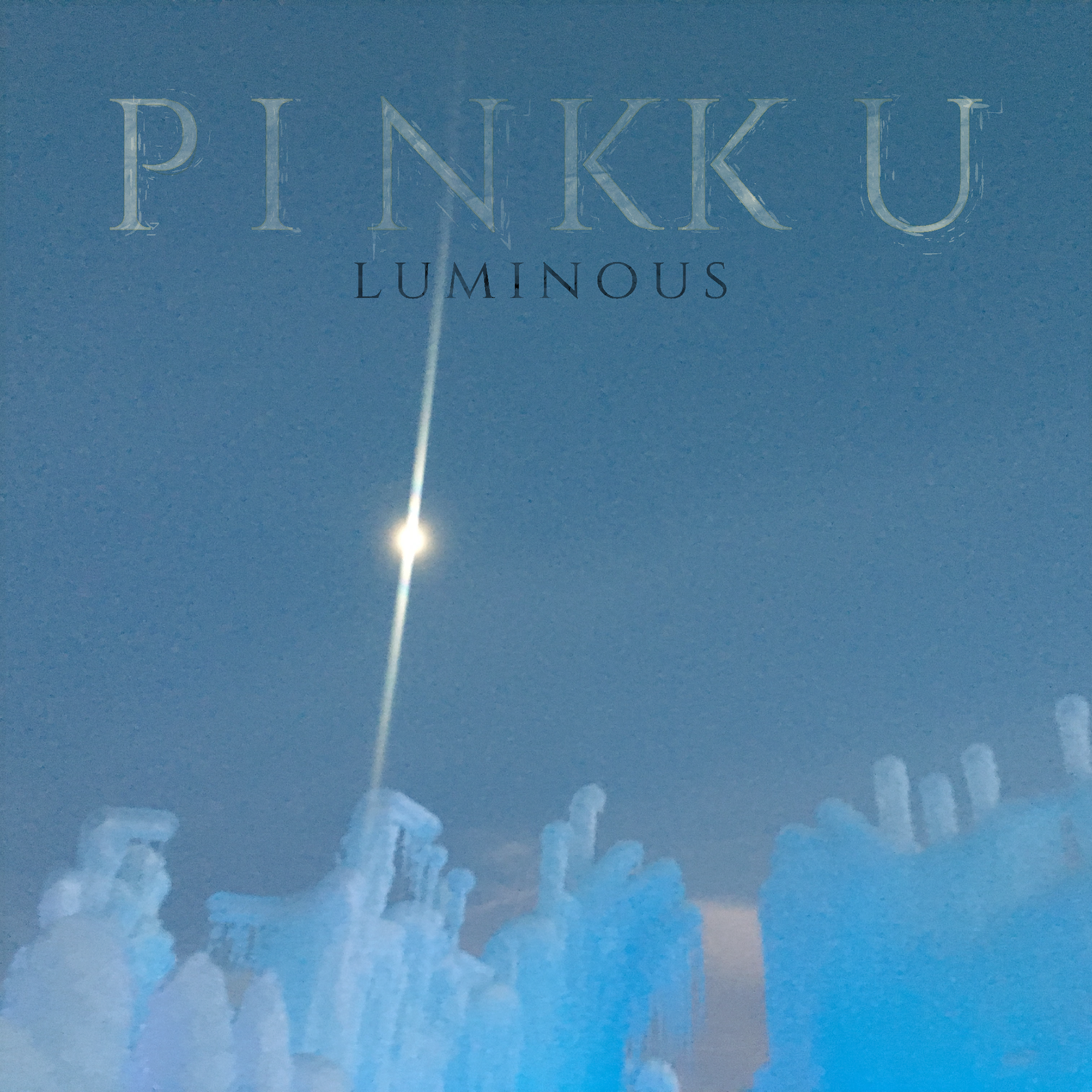
To establish a cohesive visual identity across a series of digital single releases—"Bestowers" and "Luminous"—for shoegaze/slow wave project PINKKU. Driven by project mastermind Wymond Miles, the cover art required a harmonious, interconnected design language that mirrored the band's atmospheric, reverb-drenched, and lo-fi sonic landscape.
The Process & Design Choices:
Both covers utilize original photography of icicles taken by Miles, anchored by a piercing central lens flare radiating against icy formations. To evoke a "recorded many times over a VHS tape" disintegrated aesthetic, the images were processed through heavy analog noise, chromatic degradation, and soft scanline textures:
"Bestowers": Submerged in warm, dreamlike pastel pinks, magenta glows, and soft cyan highlights—evoking an ethereal, sunset-lit haze.
"Luminous": Shifted into cool twilight blues, muted cyan, and frosted white tones—providing a cold, nocturnal counter-balance while maintaining identical compositional structure.
Typography: Unified by a subtle, semi-translucent serif logotype that sits softly embedded within the texture rather than floating above it, reinforcing the degraded analog feel.
The Result & Technical Execution:
Designed for high-resolution digital streaming platforms (Apple Music, Spotify, Bandcamp), the artwork delivers a unified visual campaign where each single feels like a distinct movement of a single artistic piece. By pairing consistent typographic placement with color-shifted analog distortion, the series builds immediate visual brand recognition for the band across digital release catalogues.