Subversive Iconography & Halftone Print Study
The Challenge:
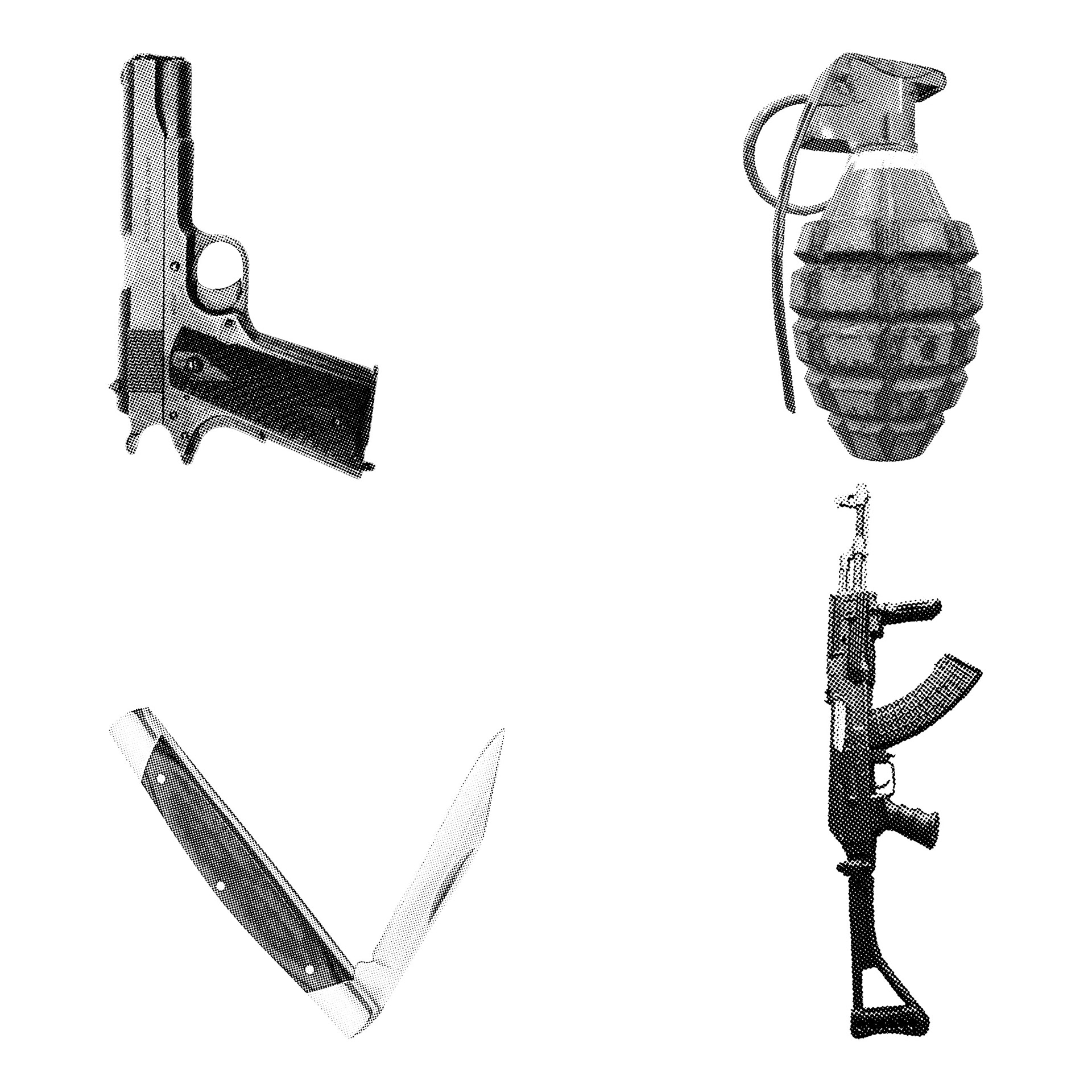
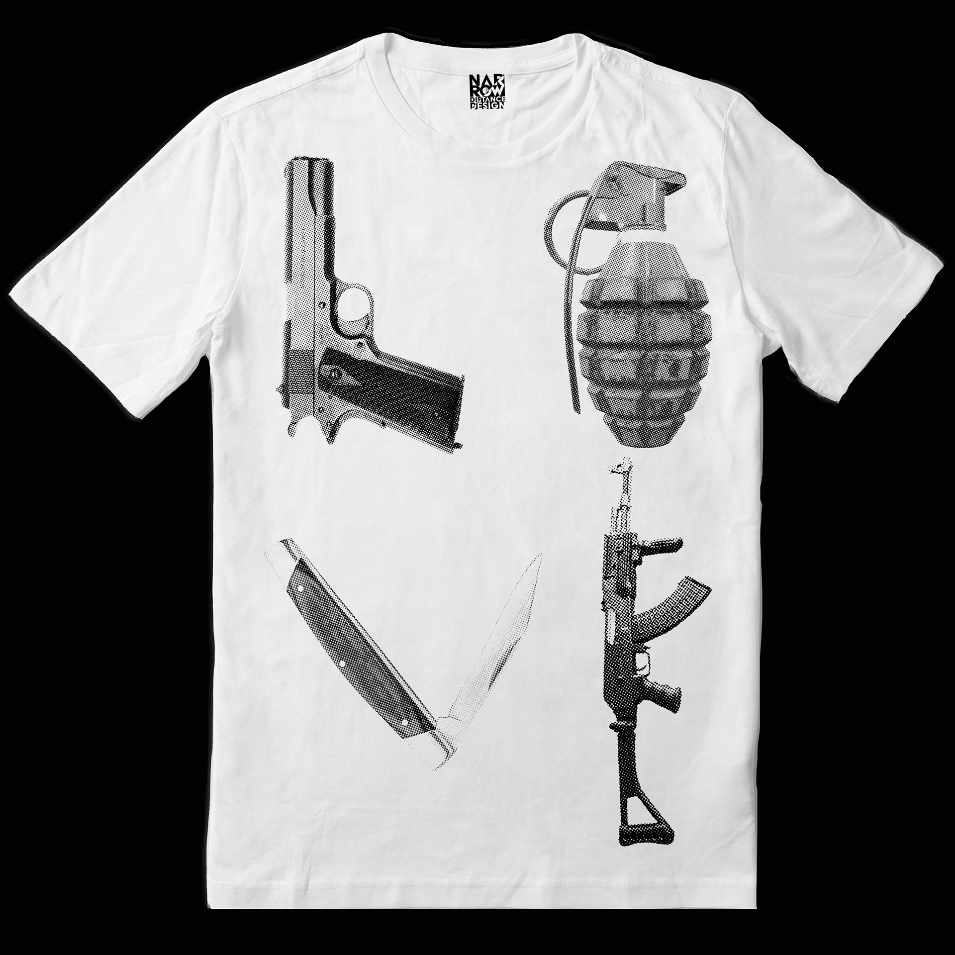
To create a compelling piece of custom apparel artwork that explores how LOVE can be constructed from tools originally designed to destroy. The project needed to leverage visual subversion and metaphor, inviting the viewer to "read between the lines" and see the unseen—while maintaining a raw, high-impact graphic presence.
The Process & Design Choices:
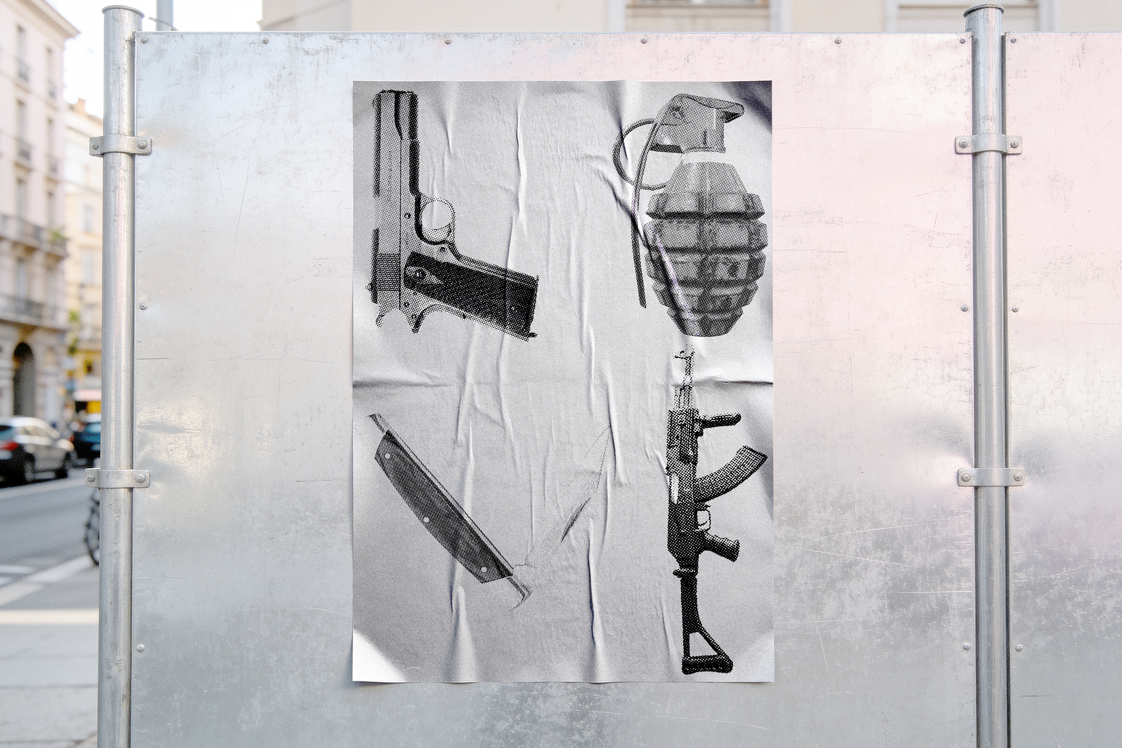
The composition subtly mirrors the iconic four-letter block typography layout, using the stark silhouettes of a pistol, hand grenade, folding knife, and assault rifle to form the letterforms for L, O, V, and E. To execute this visual irony, the imagery was processed into a coarse, high-contrast halftone. This technical choice intentionalized a gritty, analog aesthetic, drawing the viewer in with rich texture and sharp focal detail before the underlying word, and its thesis on reclamation, reveals itself.
The Result & Technical Execution:
Titled "LOVE IS WAR IS" to reflect the cyclical relationship between destruction and creation, the artwork is optimized specifically for single-color screen printing. By eliminating complex mid-tones in favor of a bold halftone dot, the file ensures maximum ink opacity, crisp edge definition, and effortless registration on a single screen across dark and light garments alike.