Print Study & Visual Resistance
The Challenge:
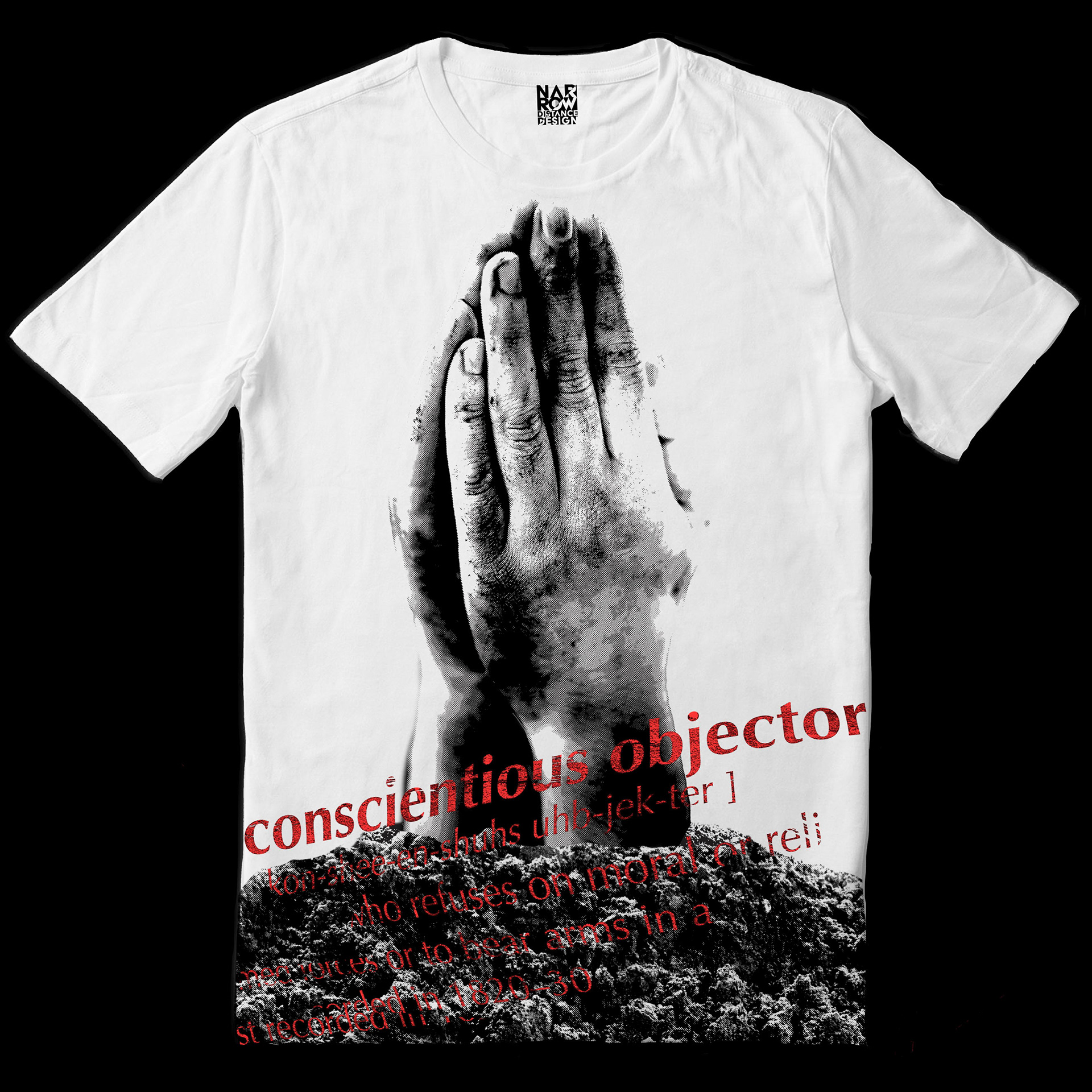
To create a high-impact piece of custom apparel artwork centered on anti-war ideals, moral agency, and the power of non-participation. The primary objective was to illustrate the weight of choosing not to partake in systemic destruction—framing peace, hope, and refusal not as passive traits, but as active, unyielding forces.
The Process & Design Choices:
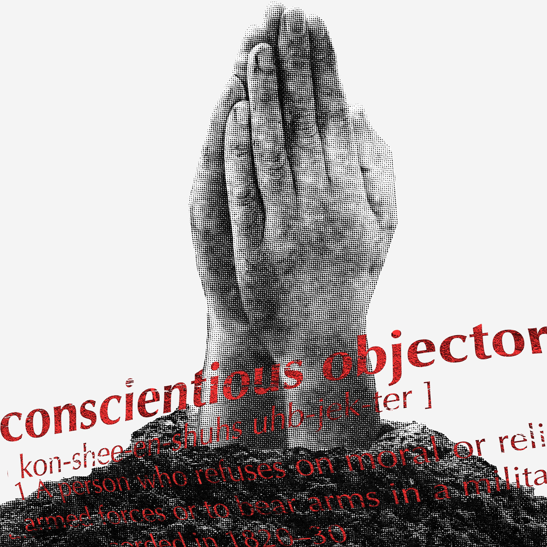
The graphic features a pair of hands emerging directly out of the dark, textured Earth in a praying formation, a visual nod to tenacity from buried conditions. Layered across the gritty terrain is the literal dictionary definition of a "conscientious objector," (complete with phonetic spelling) set in a stark, distressed red typeface to create an immediate visual interrupt. The diagonal angle and bold color juxtaposition force the viewer to pause and read the text, provoking them to evaluate where they personally stand on the spectrum of compliance and moral refusal.
The Result & Technical Execution:
Engineered as a two-color, two-screen separation (Black and Crimson Spot Red), the piece utilizes fine-tuned halftones to retain lifelike, anatomical depth in the hands while maintaining a raw, organic texture in the earth below. By separating the image into two dedicated high-contrast screens, the design achieves rich ink density, razor-sharp typographic legibility, and effortless screen registration, delivering a thought-provoking message built for production apparel.