Typographic Portrait & Digital Media Study
The Challenge:
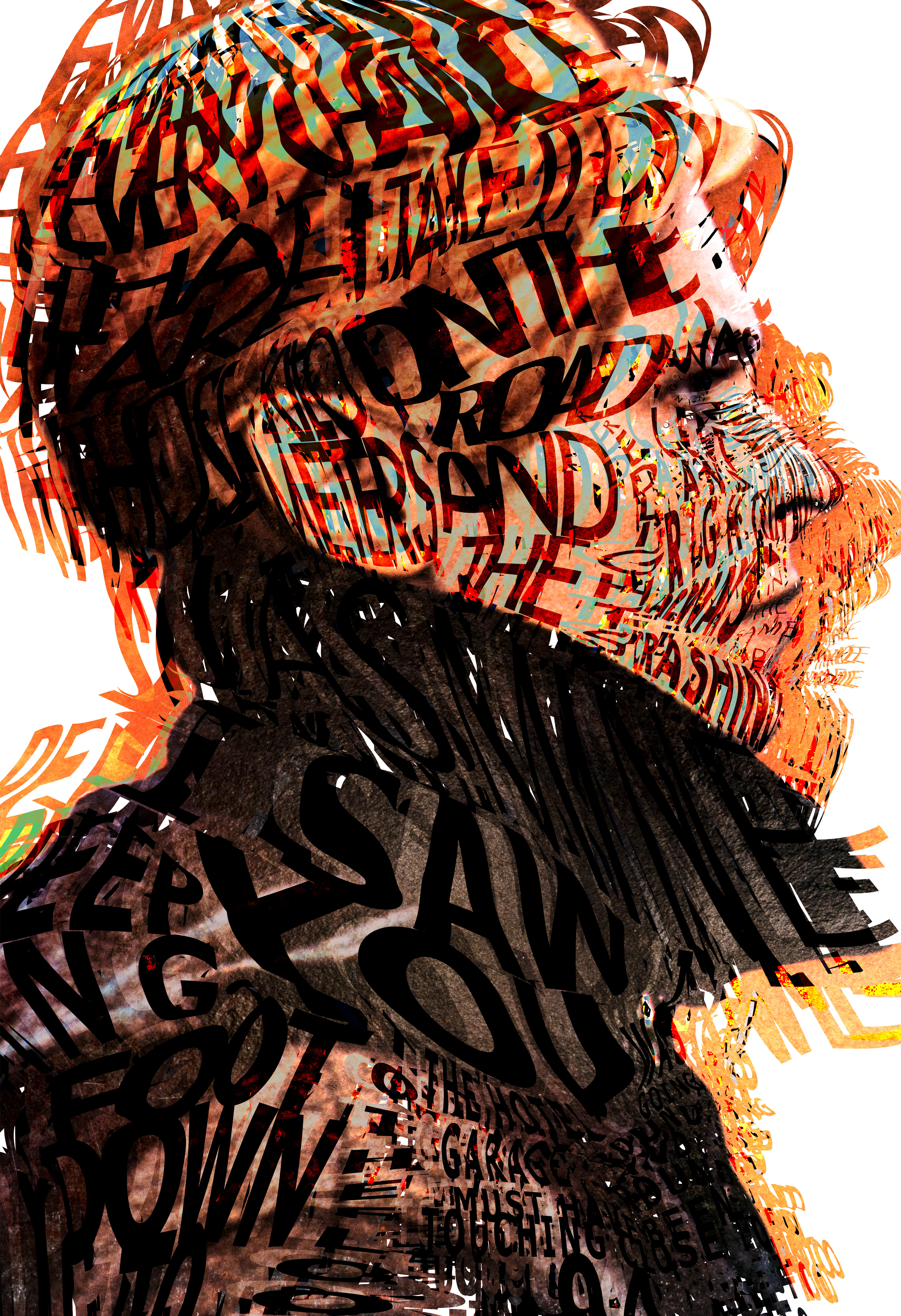
To reconstruct the iconic profile silhouette from David Bowie’s seminal 1977 album Low using only the hand-drawn lyrics from "Always Crashing in the Same Car." The objective was to avoid standard vector tracing or flat typography, instead allowing Bowie’s own words to organically manifest his face, hair, and coat collar in a rich, multi-layered visual tribute.
The Process & Design Choices:
Using a mouse pad to manually map out and hand-draw the lettering directly into the spatial contours, the composition utilizes varying line weights, gestural warping, and dense text clustering to build form, shadow, and highlights. To honor the distinct aesthetic of the original album cover, multiple digital blending modes were stacked over soft pastel oranges, teals, and rust tones. The resulting interplay between legibility and abstract form creates an atmospheric, analogue glow—drawing the viewer in close to read the lyrics before stepping back to reveal the portrait.
The Result & Technical Execution:
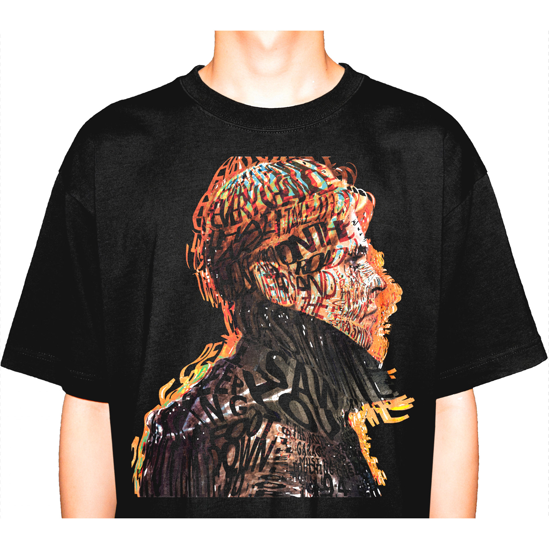
The graphic's structural clarity allows it to scale seamlessly across vastly different mediums without losing structural fidelity—translating effortlessly from a high-density custom apparel print and a 1" collectible button all the way to a large-format fine art giclée print. By combining digital layer blending with raw, hand-drawn typography, the piece captures the experimental, Berlin-era spirit of Bowie's work in a versatile production-ready master file.